PO BOX 505, Wyandotte, OK 74370, USA
Phone 01-918-542-4148
Phone Hours: 9-3 CT/M-Th | Emails generally answered within one working day
Designing Covers
Click on underlined text for more general information.
Do | Don't | Basic Format
Elements-click for more links | Add "Oomph"
Digital |
Elements |
Font |
Margins |
Photos |
Title
 Begin by being comfortable: It is recommended that an individual learn as much as they can
about the chosen cover method, and requirements for that cover design. Don’t
handicap yourself from the start by knowing just enough to get by. As with
manuscript design, there is
no "silver bullet" for proper cover design or format. However, there are
some very basic ideas to get you ready to go for both covers and manuscripts:
Do credit your sources - even for covers. May be done on text pages.
Do take your budget into consideration.
Do be creative. Click for ideas and examples of fonts, elements, margins, photos/graphics.
Do follow ISBN requirements (if used) and other laws.
Do consider archival quality.
Do seek help. Click for ideas and examples of fonts, elements, margins, photos/graphics, QR Codes.
Unless you are providing a camera ready cover layout along with your finalized manuscript, check with your publisher to see if they are willing to work on the design with you before you have your manuscript complete. Terms may vary, but as cover design can turn into a long process, it is usually worth it to get a jump start - unless you have no expectation of actual publish date.
Do have fun.
Designs for the same book:

Deluxe hard cover (custom line imprint) Collectors Edition (out of print) and
color soft cover (in print).


Consider changing the look, just by changing the color!
Don't do anything to your cover that you hate to come across.
Don't over clutter - often trying to get "more bang for the buck".
Don't use small type if you want older people to easily identify your work.
Basic design elements to consider
photos - quality, content, and captions

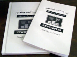
Black and White hard and soft cover mirrored
design.
The choice of b/w complements the subject of the work - newspapers.

Books with planned hard and soft cover editions may be published at the same
time to reduce printing costs. Cover design may be the same, similar, or totally
different.
Some basic ideas to make your publication special (some ideas for Hardbound {HB} or Sofbound {SB} only)
Make a trip to the bookstore and note likable or hated covers, use this as a guideline or springboard for ideas. Do not limit yourself by subject or size for this step.
Consider using a pre-planned color palette.
Use clipart or stock photography to liven up layout where you don't have items specific to the book to use.
For more than one book in a series, or from the same author, consider using the same basic layout in different colors.
HB: Match your end papers to the cover (main) color.
HB: Use custom printed end sheets (end papers).
HB: If economical or offered, use stock pre-printed end papers such as marbleized, etc.
HB:
Consider dust jackets versus color covers.
SB: Print on the inside of the cover.
For more suggestions
on this subject and more, order our book:
![]() G550-$20.00
WRITING Family History Or Genealogy For Pleasure and Profit
Complete Edition, by Gregath Company,
Inc.,
*updated* 2015. ISBN:
978-0-944619-00-1, 8½x11",
softbound book, 132 pages, suggestions & examples of all facets of your project
for the typist and/or computer user. Note: All G prefix books 100 pages or more, this one included, that are SB can be special ordered in hard cover edition -
contact
for details.
Also available on disk. |
Click here for more
information.
G550-$20.00
WRITING Family History Or Genealogy For Pleasure and Profit
Complete Edition, by Gregath Company,
Inc.,
*updated* 2015. ISBN:
978-0-944619-00-1, 8½x11",
softbound book, 132 pages, suggestions & examples of all facets of your project
for the typist and/or computer user. Note: All G prefix books 100 pages or more, this one included, that are SB can be special ordered in hard cover edition -
contact
for details.
Also available on disk. |
Click here for more
information.
> Home Page >
Book Preparation Tips >
Getting Started >
Publication Design > Cover Design
> Home Page >
Book Preparation Tips >
Publication Design >
Cover Design